

Color wields an extraordinary power over our emotions, perceptions, and environments. It can transform a mundane space into a vibrant oasis, influence our moods, and even shape our personal style. Understanding how to choose the perfect color variant for you involves delving into color theory, assessing personal preferences, and considering environmental factors. By mastering these elements, you can harness the full potential of color to create spaces and styles that resonate deeply with your identity.
Understanding Color Theory
The Basics of Color Theory
Color theory is the foundation for understanding how colors interact, complement, and contrast with one another. At its core, it involves the study of the color wheel and the relationships between different hues. Primary colors—red, blue, and yellow—cannot be created by mixing other colors and serve as the basis for all other colors. Secondary colors—green, orange, and purple—are formed by mixing two primary colors. Tertiary colors arise from mixing primary and secondary colors, leading to a more nuanced palette.
The Color Wheel: Primary, Secondary, and Tertiary Colors
The color wheel is a visual representation of colors arranged in a circle, illustrating the relationships between primary, secondary, and tertiary colors. This tool helps in identifying complementary colors, which are opposite each other on the wheel and create striking contrasts. Analogous colors, located next to each other, offer a harmonious and pleasing combination. Understanding these relationships is essential for creating balanced and dynamic color schemes.
Warm vs. Cool Colors: Impact on Mood and Perception
Colors are broadly categorized into warm and cool tones, each evoking different emotions and atmospheres. Warm colors like red, orange, and yellow are energizing and stimulating, often associated with warmth, excitement, and action. In contrast, cool colors such as blue, green, and purple evoke calmness, relaxation, and tranquility. The psychological impact of color is significant in both personal spaces and fashion, influencing our moods and behaviors subconsciously.
Assessing Your Personal Style
Identifying Your Style Preferences
Your personal style is a reflection of your tastes, experiences, and personality. Identifying your style preferences involves exploring the colors that you naturally gravitate towards and feel most comfortable with. Are you drawn to bold, vibrant hues or prefer understated, neutral tones? Do you favor classic elegance or contemporary trends? Understanding your style preferences helps in choosing color variants that align with your unique identity.
Color Psychology: What Your Favorite Colors Say About You
Color psychology explores how different hues influence our emotions and perceptions. Your favorite colors can reveal aspects of your personality and how you interact with the world. For instance, a preference for blue may indicate a calm, trustworthy, and reliable nature, while a love for red might suggest passion, energy, and a bold personality. By understanding color psychology, you can select colors that not only appeal aesthetically but also resonate on a deeper, psychological level.
Matching Colors to Your Personality
Matching colors to your personality involves choosing hues that reflect your traits and enhance your mood. Consider colors that complement your daily activities and environments. For example, if you have a high-energy lifestyle, vibrant colors like orange and yellow can invigorate your space. Conversely, if you seek tranquility and relaxation, cool tones like blue and green can create a serene atmosphere. Aligning colors with your personality ensures that your surroundings feel authentic and supportive.
Considering Your Environment
Colors for Different Rooms: Creating the Right Ambiance
Each room in your home serves a different purpose and thus benefits from a tailored color scheme. In living rooms and social spaces, warm and inviting colors like soft yellows, rich browns, or muted reds create a cozy ambiance. For bedrooms, calming colors such as lavender, pastel blues, or gentle greens promote relaxation and restful sleep. Kitchens often benefit from bright, energizing colors like cheerful yellows or crisp whites, while bathrooms can feel refreshing with cool blues and seafoam greens. Tailoring colors to the function of each room enhances the overall harmony and usability of your home.
Outdoor vs. Indoor Color Choices
When choosing colors for outdoor and indoor spaces, consider the different lighting conditions and the materials involved. Outdoor colors need to withstand changing weather conditions and may appear different under natural light compared to artificial indoor lighting. Earthy tones like terracotta, moss green, and stone grey blend well with natural surroundings and create a seamless transition between the interior and exterior. For indoor spaces, the controlled lighting allows for a broader range of colors, from bold accent walls to subtle pastels, offering more flexibility in design choices.
Harmonizing with Existing Decor
Incorporating new colors into an existing decor scheme requires a thoughtful approach to ensure harmony and cohesion. Start by identifying the dominant colors in your current decor and choose new colors that complement or enhance these tones. Use accent pieces like cushions, throws, and artwork to introduce new colors gradually. Consider creating a mood board to visualize how different colors will interact with your existing decor. Harmonizing colors with your decor creates a unified and aesthetically pleasing environment.
Skin Tone and Color Harmony
Determining Your Skin Undertone: Warm, Cool, or Neutral
Understanding your skin undertone is the first step to finding colors that complement your complexion and enhance your natural beauty. Skin undertones fall into three categories: warm, cool, and neutral. To determine your undertone, observe the veins on your wrist. If they appear greenish, you likely have a warm undertone. If they look bluish, you have a cool undertone. If you find it difficult to decide or see a mix of both, you probably have a neutral undertone. Knowing your undertone helps you choose colors that harmonize with your skin, making you look more vibrant and radiant.
Best Colors for Warm Undertones
For those with warm undertones, colors that reflect the earth’s natural warmth are most flattering. Think rich, golden hues like mustard, terracotta, and coral. Olive green, honey, and warm reds also complement warm undertones beautifully. These colors enhance the natural warmth of your skin, creating a harmonious and glowing appearance. Incorporating these shades into your wardrobe and makeup can bring out the best in your complexion.
Best Colors for Cool Undertones
Cool undertones are best complemented by colors with blue or pink bases. Jewel tones like sapphire, emerald, and amethyst enhance cool undertones, as do icy shades like lavender, soft pink, and cool blues. These colors work to highlight the natural coolness in your complexion, making your skin look brighter and more even. Wearing these shades can add a crisp, fresh look to your appearance, making your skin look luminous.
Versatile Colors for Neutral Undertones
Those with neutral undertones have the flexibility to wear a wide range of colors, as both warm and cool shades can be flattering. Neutral tones such as taupe, beige, and cream work well, as do more vibrant colors like teal, burgundy, and dusty rose. The key is to find a balance that doesn’t overwhelm your natural coloring. Neutral undertones benefit from a versatile palette, allowing you to experiment with various colors and combinations to find what makes you feel most confident and radiant.
Fashion and Color Variants
Building a Capsule Wardrobe with Color
Creating a capsule wardrobe involves selecting versatile, timeless pieces that can be mixed and matched to create multiple outfits. Incorporating a thoughtful color palette into your capsule wardrobe ensures that all pieces complement each other. Choose a base of neutral colors like black, white, grey, and navy, then add a few accent colors that suit your skin tone and personal style. This approach not only simplifies dressing but also ensures you always have a cohesive and stylish look.
Seasonal Color Palettes: Spring, Summer, Fall, Winter
Each season brings a unique palette that can inspire your wardrobe choices. Spring colors include soft pastels and bright florals, reflecting the freshness of the season. Summer palettes are bold and vibrant, with tropical hues like turquoise, coral, and sunny yellow. Fall brings warm, earthy tones like burnt orange, olive green, and deep burgundy. Winter palettes are rich and dramatic, featuring jewel tones and cool neutrals. Adapting your wardrobe to seasonal color palettes keeps your style fresh and appropriate for the time of year.
Accessorizing with Color: Adding Pops of Color to Outfits
Accessories are a great way to introduce pops of color into your outfits without overwhelming your look. Scarves, jewelry, handbags, and shoes in bright or contrasting colors can add interest and personality to a neutral outfit. Choose accessories in colors that complement your skin tone and the overall palette of your wardrobe. This strategy allows you to experiment with color and stay on-trend without committing to bold hues in your main clothing pieces.
Color in Home Decor
Choosing Wall Colors: Tips and Tricks
Selecting the right wall color is crucial for setting the tone of a room. Consider the size of the space, the amount of natural light it receives, and the mood you want to create. Light colors like soft whites, pale blues, and light grays can make a room feel larger and more open. Darker shades like deep navy, charcoal, and forest green add coziness and sophistication. Test paint samples on your walls and observe how they look at different times of the day before making a final decision.
Furniture and Fabric: Coordinating Colors for Cohesion
When choosing furniture and fabrics, aim for a cohesive color scheme that ties the room together. Start with a neutral base for larger pieces like sofas and rugs, then add color through smaller items like cushions, throws, and curtains. Consider texture and pattern as well, as they can add depth and interest to the color scheme. Harmonizing furniture and fabric colors creates a balanced and inviting space.
Using Accent Colors to Enhance Spaces
Accent colors are an effective way to add personality and visual interest to a room. Choose one or two accent colors that complement your main color scheme and use them strategically throughout the space. This can be achieved through artwork, decorative objects, and even smaller furniture pieces. Accent colors should be used sparingly to avoid overwhelming the room, but when done correctly, they can highlight architectural features and create focal points.
Color in Branding and Design
The Importance of Color in Branding
Color plays a critical role in branding as it evokes emotions and conveys messages subconsciously. The right color choices can enhance brand recognition, communicate values, and influence consumer behavior. For instance, blue is often associated with trust and reliability, making it a popular choice for financial institutions. Red evokes excitement and urgency, commonly used in marketing and sales. Understanding the psychological impact of colors helps in creating a brand identity that resonates with the target audience.
Choosing Colors for Logos and Marketing Materials
Selecting colors for logos and marketing materials involves considering the brand’s personality, target audience, and industry standards. A well-designed logo with a thoughtful color palette can distinguish a brand from its competitors and create a lasting impression. It’s important to choose colors that reflect the brand’s values and appeal to its audience. Consistency in color usage across all marketing materials, from websites to packaging, reinforces brand identity and fosters recognition.
Case Studies: Successful Color Branding
Examining successful color branding case studies provides valuable insights into effective color use. For example, Coca-Cola’s red color is instantly recognizable and associated with excitement and happiness. Apple’s use of sleek, minimalist colors like silver and white conveys innovation and sophistication. These case studies demonstrate how strategic color choices can enhance brand perception and build a strong, memorable identity. Analyzing these examples can inspire and guide your own color branding efforts.
Exploring Color Trends
Current Color Trends and Their Origins
Color trends are influenced by a myriad of factors, including cultural shifts, technological advancements, and global events. Current color trends often reflect society’s collective mood and aspirations. For instance, the recent rise in popularity of calming, earthy tones can be attributed to a collective desire for tranquility and connection with nature during turbulent times. Pantone’s Color of the Year and the color palettes of major fashion weeks are significant indicators of trending colors. These trends often originate from industries like fashion, interior design, and technology, gradually permeating other sectors such as branding and product design.
Predicting Future Color Trends
Predicting future color trends involves analyzing current societal trends, emerging technologies, and cultural movements. Color forecasters study global events, economic conditions, and social media trends to anticipate the colors that will resonate with the public in the coming years. For example, the increasing focus on sustainability and environmental consciousness suggests a future trend towards more natural, muted colors. Additionally, advancements in digital technology and virtual reality may lead to the popularity of vibrant, futuristic hues. Staying informed about these influencing factors can help you stay ahead of the curve in color trends.
How to Incorporate Trends Without Overcommitting
Incorporating color trends into your life or business without overcommitting involves strategic and selective application. Start with small, easily changeable elements such as accessories, accent pieces, or digital graphics. For instance, if a particular shade of blue is trending, introduce it through throw pillows, artwork, or website highlights. This approach allows you to stay current without making significant, long-term changes that might quickly become outdated. Additionally, consider blending trending colors with classic, timeless hues to create a balanced and enduring aesthetic.
Cultural Significance of Colors
Colors in Different Cultures: Meanings and Traditions
Colors hold different meanings and significance across various cultures, influenced by historical, religious, and social contexts. For instance, in Western cultures, white is often associated with purity and weddings, while in many Eastern cultures, it symbolizes mourning and funerals. Red is considered lucky and auspicious in Chinese culture, often used in celebrations and festivals, whereas it can signify danger or caution in other contexts. Understanding these cultural nuances is essential, especially in global communications and branding, to ensure messages are appropriately conveyed and received.
Adapting Color Choices for a Global Audience
When targeting a global audience, adapting your color choices to respect cultural differences is crucial. Research the color meanings and preferences of your target demographics to avoid potential misunderstandings or offenses. For international branding, consider using a neutral color palette that appeals broadly, while incorporating culturally significant colors in localized marketing materials. This approach demonstrates cultural sensitivity and enhances your brand’s global appeal.
Respecting Cultural Sensitivities in Color Use
Respecting cultural sensitivities involves more than just choosing the right colors; it also includes understanding the context and proper application. For example, using specific colors during cultural or religious events requires careful consideration of their traditional significance. Collaborating with cultural consultants or conducting thorough research can help ensure that your color choices are respectful and appropriate. This attention to detail fosters positive connections with diverse audiences and shows respect for their cultural values.
Color and Lighting
The Role of Lighting in Color Perception
Lighting significantly impacts how colors are perceived, influencing their hue, brightness, and saturation. Natural light, which changes throughout the day, can alter the appearance of colors, making them look warmer in the morning and cooler in the afternoon. Artificial lighting, depending on its type (incandescent, fluorescent, LED), can also affect color perception. For instance, incandescent lighting casts a warm, yellowish glow, while fluorescent lighting can make colors appear cooler and harsher. Understanding these effects is essential for choosing colors that look consistent and appealing under different lighting conditions.
Choosing Colors Based on Natural vs. Artificial Light
When selecting colors for any space, consider the predominant lighting. For rooms with ample natural light, you can experiment with a wider range of colors, as natural light enhances the true appearance of hues. In contrast, spaces primarily lit by artificial light require careful selection to avoid color distortion. Test paint samples and fabrics under both types of lighting to see how they appear throughout the day and night. This practice ensures that the colors you choose will remain true to your vision in various lighting conditions.
Using Lighting to Enhance Color Choices
Strategic lighting can enhance and even transform your color choices, creating the desired mood and atmosphere. Use directional lighting to highlight accent walls or artwork, drawing attention to specific colors. Dimmer switches allow you to adjust the intensity of light, creating different moods with the same colors. Colored lighting, such as LED strips, can add a dynamic and contemporary touch, allowing you to change the ambiance of a room with ease. Proper lighting design enhances your color scheme and adds depth and dimension to your spaces.
Digital vs. Physical Color
Understanding RGB and CMYK Color Models
The RGB (Red, Green, Blue) and CMYK (Cyan, Magenta, Yellow, Black) color models are essential for digital and print media, respectively. The RGB model is used for electronic displays, combining different intensities of red, green, and blue light to create a wide range of colors. In contrast, the CMYK model is used in printing, mixing cyan, magenta, yellow, and black inks to produce various hues. Understanding these models is crucial for ensuring accurate color reproduction in different media, as colors can appear differently on screens compared to printed materials.
Color Matching for Print and Digital Media
Achieving consistent color matching between print and digital media can be challenging due to the different color models and the way colors are produced. To ensure accurate color representation, use Pantone color guides, which provide standardized colors that can be matched across various platforms. Additionally, calibrate your monitors and printers regularly to maintain color consistency. Understanding the limitations and capabilities of both media helps in making informed decisions for color matching, ensuring your designs look their best in all formats.
Tools for Accurate Color Representation
Various tools and technologies are available to help achieve accurate color representation. Color calibration tools, such as colorimeters, ensure your screen displays colors correctly. Digital color tools like Adobe Color allow you to create and test color palettes online, providing a visual reference for your designs. Print proofing tools, like Pantone guides, help verify that printed colors match your digital designs. Using these tools ensures consistency and accuracy in color representation, enhancing the quality and professionalism of your work.
Practical Tools for Choosing Colors
Color Swatches and Paint Samples
Color swatches and paint samples are invaluable tools for visualizing how a color will look in a specific space. Swatches allow you to see a range of shades and tones, helping you narrow down your choices. Paint samples, on the other hand, let you test the color on your walls to observe how it looks in different lighting conditions throughout the day. Applying paint samples in small areas can prevent costly mistakes and ensure that the chosen color harmonizes with your decor and desired ambiance.
Digital Color Tools and Apps
In the digital age, numerous tools and apps can assist in color selection. Apps like Adobe Color, ColorSnap by Sherwin-Williams, and Pantone Studio allow you to create, explore, and compare color palettes easily. These tools often include features like color matching, palette generation, and the ability to visualize colors in different settings. Digital color tools make it convenient to experiment with various combinations and find the perfect hues for your project.
Virtual Room Painting Tools
Virtual room painting tools are a game-changer for interior design. These online platforms and apps let you upload a photo of your room and digitally apply different paint colors to the walls. This visualization helps you see how various shades will interact with your furniture, flooring, and natural light. Tools like Benjamin Moore’s Personal Color Viewer and Home Depot’s Project Color app provide a realistic preview, making it easier to make informed decisions before committing to a color.
DIY Color Experiments
Creating a Color Mood Board
A color mood board is a creative and effective way to compile your favorite colors and visualize how they work together. Use magazine cutouts, fabric samples, paint swatches, and digital images to create a collage that represents your desired color scheme. This visual reference helps you refine your choices and ensures that all selected colors harmonize well. Mood boards can be physical or digital, providing flexibility in how you approach your color planning.
Testing Colors in Small Areas
Testing colors in small, inconspicuous areas allows you to see how a color looks in your actual space without committing to an entire wall. Paint a small section and observe it at different times of the day under various lighting conditions. This practical step helps you gauge the true appearance of the color and prevents unexpected results. It’s an essential part of the decision-making process, ensuring satisfaction with the final outcome.
Mixing Custom Colors
For those seeking a unique hue, mixing custom colors can be an exciting option. Start with a base color and gradually add small amounts of other colors to achieve your desired shade. This method allows for personalized and distinctive color creations that aren’t available off-the-shelf. Custom mixing can be done with paint, dyes, or even makeup, providing endless possibilities for tailored color variants that reflect your individual style.
Avoiding Common Color Mistakes
Overwhelming Spaces with Too Much Color
While color adds vibrancy and character to a space, too much of it can be overwhelming. Avoid using too many bold colors in one area, which can create a chaotic and cluttered feel. Instead, balance bright hues with neutral tones to maintain harmony and visual interest. Consider using bold colors as accents rather than dominant shades, ensuring a balanced and aesthetically pleasing environment.
Clashing Colors: What to Avoid
Clashing colors can disrupt the visual harmony of a space, making it appear disjointed and unappealing. Avoid pairing colors that are too similar in intensity or that belong to conflicting segments of the color wheel. For example, bright red and neon green can clash due to their contrasting vibrancies. Use complementary colors wisely, ensuring they enhance rather than compete with each other. Subtle variations and harmonizing shades can create a cohesive and attractive color scheme.
Balancing Bold and Neutral Colors
Achieving a balance between bold and neutral colors is key to creating a dynamic yet harmonious space. Use neutrals like white, beige, or gray as a backdrop to highlight bold accents such as vibrant furniture, artwork, or decorative accessories. This approach allows the bold colors to stand out without overwhelming the space. Balancing these elements creates a sophisticated and well-coordinated look that is visually appealing and comfortable to live in.
Color Maintenance and Longevity
Choosing Durable Colors for High-Traffic Areas
High-traffic areas like hallways, kitchens, and living rooms require colors that can withstand wear and tear. Choose durable, washable paints and fabrics that resist stains and fading. Look for products labeled as high durability or washable, which are designed to maintain their appearance despite frequent use. Durable colors ensure that your spaces look fresh and vibrant for longer, reducing the need for frequent touch-ups.
Maintaining Color Vibrancy Over Time
Maintaining color vibrancy involves regular cleaning and proper care. Dust and grime can dull colors, so routine cleaning with appropriate products is essential. For painted walls, use a mild detergent and a soft cloth to avoid damaging the finish. Protect fabrics and upholstered items from direct sunlight to prevent fading. Regular maintenance keeps colors looking vivid and fresh, preserving the aesthetic appeal of your spaces.
Refreshing Faded Colors
Over time, even the most vibrant colors can fade. Refreshing faded colors can breathe new life into your environment. Consider reapplying a fresh coat of paint or using fabric dyes to restore the original hue. For a quick fix, use touch-up paint or fabric markers on small areas. Regularly updating your color scheme keeps your home looking modern and well-maintained, reflecting your attention to detail and commitment to a beautiful living space.
Expert Advice on Color Selection
Interview with a Professional Color Consultant
Gaining insights from a professional color consultant can provide valuable guidance in your color selection process. Color consultants have expertise in color theory, trends, and practical applications, helping you make informed decisions. An interview with a consultant can reveal tips on choosing colors that complement your style, enhance your space, and reflect your personality. Their expert advice can elevate your color choices and ensure a successful outcome.
Real-Life Examples and Success Stories
Exploring real-life examples and success stories can inspire and inform your color selection. Look for case studies and testimonials from individuals or designers who have successfully implemented color schemes similar to what you envision. These stories provide practical insights and demonstrate how different colors can transform a space. Learning from others’ experiences can help you avoid common pitfalls and achieve your desired results.
Tips from Interior Designers and Fashion Experts
Interior designers and fashion experts have a keen eye for color and style, offering valuable tips and recommendations. Their expertise in creating cohesive and aesthetically pleasing color schemes can guide your choices in both home decor and fashion. From selecting complementary colors to mixing bold and neutral shades, their tips can help you create a polished and sophisticated look. Incorporating professional advice ensures that your color choices are both stylish and practical.
Eco-Friendly Color Choices
Sustainable and Non-Toxic Paint Options
Eco-friendly color choices are increasingly important in today’s environmentally conscious world. Sustainable and non-toxic paint options provide vibrant colors without harmful chemicals. Look for paints labeled as low-VOC (volatile organic compounds) or zero-VOC, which reduce indoor air pollution and are safer for your health. Brands like Benjamin Moore’s Natura and Sherwin-Williams’ Harmony offer eco-friendly options that deliver beautiful results while protecting the environment.
Eco-Friendly Fabrics and Materials
Choosing eco-friendly fabrics and materials extends your commitment to sustainability beyond paint. Opt for organic cotton, bamboo, and recycled materials for textiles and furnishings. These materials are produced with minimal environmental impact and often feature natural dyes and finishes. Eco-friendly fabrics not only enhance your space with beautiful colors but also support a healthier planet.
Ethical Considerations in Color Production
Ethical considerations in color production involve choosing products made through fair labor practices and environmentally responsible methods. Research brands and manufacturers to ensure they adhere to ethical standards, such as fair wages and safe working conditions. Supporting companies that prioritize sustainability and ethical production helps promote positive change in the industry and contributes to a more equitable and sustainable world.
Psychological Effects of Color
How Colors Influence Behavior and Emotions
Colors have a profound impact on our behavior and emotions, influencing how we feel and interact with our environment. Warm colors like red and yellow can stimulate excitement and energy, while cool colors like blue and green promote calmness and relaxation. Understanding these psychological effects allows you to choose colors that create the desired mood and atmosphere in your spaces. Whether you want to energize a living room or create a serene bedroom, selecting the right colors can enhance your overall well-being.
Using Color to Create a Calming Environment
Creating a calming environment involves selecting colors that promote tranquility and relaxation. Soft blues, greens, and neutrals are ideal for bedrooms, bathrooms, and other spaces where you seek peace and comfort. These colors reduce stress and encourage relaxation, making them perfect for unwinding after a long day. Incorporating calming colors into your decor can improve your mental and emotional health, providing a sanctuary from the hectic pace of everyday life.
Energizing Spaces with Vibrant Colors
In spaces where you want to foster energy and creativity, vibrant colors are key. Bold shades of red, orange, and yellow can invigorate and inspire, making them perfect for home offices, kitchens, and workout areas. These colors stimulate the mind and body, boosting productivity and motivation. By strategically using vibrant colors, you can create dynamic and energetic spaces that enhance your daily activities.
Personalizing Your Color Palette
Combining Favorite Colors for Unique Variants
Personalizing your color palette involves combining your favorite colors to create unique and distinctive variants. Experiment with different shades and tones to find combinations that reflect your personality and style. Consider using color blending tools or consulting with a professional to achieve the perfect balance. Personalized color variants make your space feel uniquely yours and add a personal touch that standard palettes can’t match.
Creating a Signature Color Scheme
A signature color scheme is a cohesive palette that represents your style and preferences. Start with a few base colors and build your palette with complementary shades and accents. Use this scheme consistently throughout your home or wardrobe to create a unified and polished look. A signature color scheme not only enhances your aesthetic but also simplifies decision-making when adding new elements to your space or wardrobe.
Adjusting Colors for Different Seasons and Trends
Adapting your color palette for different seasons and trends keeps your spaces and style fresh and current. In spring and summer, lighter and brighter colors reflect the vibrant energy of the season, while fall and winter call for richer, warmer tones. Stay updated with color trends and incorporate them into your existing palette through accessories and accents. This flexibility ensures your spaces remain stylish and relevant year-round.
Conclusion: Embracing Your Perfect Color Variant
Choosing the perfect color variant is a journey of discovery and creativity. By understanding color theory, assessing your personal style, and considering environmental factors, you can select colors that enhance your life and reflect your unique identity. Embrace the power of color to transform your spaces and express your personality, creating environments that inspire and delight.
Additional Resources
Recommended Books on Color Theory and Design
Expand your knowledge with books like “Interaction of Color” by Josef Albers and “Color: A Natural History of the Palette” by Victoria Finlay. These resources provide in-depth insights into the world of color, enhancing your understanding and application of color theory.
Online Courses and Workshops
Online platforms like Coursera and Skillshare offer courses and workshops on color theory, interior design, and fashion styling. These educational resources provide practical skills and knowledge to help you make informed color choices.
Helpful Websites and Blogs on Color Trends and Tips
Stay updated with the latest color trends and tips by following websites and blogs like Pantone, Color Matters, and Design Seeds. These platforms offer inspiration, advice, and the latest updates in the world of color, keeping you informed and inspired.

How Clipping Path Services Help eCommerce Businesses Grow Faster
Categories In ecommerce, product images do a lot of heavy lifting. They shape first impressions,…

Amazon Apparel Image Mistakes That Secretly Kill Sales (2026 Fix Guide)
Categories Introduction If your clothing products are not converting on Amazon, there’s a high chance…

How We Helped an E-commerce Brand Increase Sales by 35% with Professional Retouching
When it comes to e-commerce, first impressions are crucial. A shopper’s decision to click “Add…
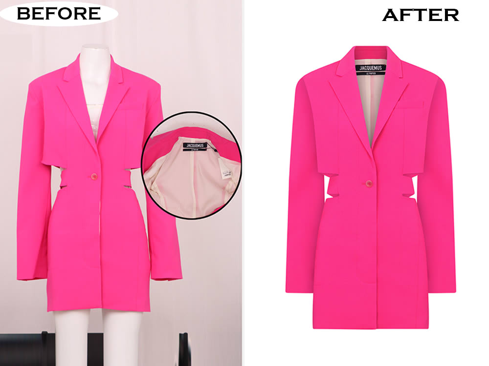
Ghost Mannequin Photography for Apparel: How to Showcase Clothing Better Online
Categories When shoppers buy clothing online, they cannot touch the fabric, try on the fit,…
Spring Fashion 2025 Color Trends for Ecommerce Product Photos
Categories Spring collections are about freshness, color, and new arrivals—but for ecommerce brands, seasonal success…

Real Estate Photo Remote Editing: The Ultimate Guide to Enhancing Property Images
Empowering Success TogetherReal Estate Photo Remote Editing: The Ultimate Guide to Enhancing Property ImagesWe provide…